On Friday, The New York Mets became the latest Major League Baseball Team to introduce its City Connect uniforms. These uniforms tend to be completely different from teams’ everyday jerseys. Like them or not, these jerseys tell a story and honor the city a particular team represents.
The Mets are no different. For those who don’t know, Queens is one of the five boroughs of New York City and is known as the “The World’s Borough.” The main focus of these uniforms is to pay homage to New York City and all the ways Queens connect to the other boroughs.
In our City Connect era. #IYKNYYKhttps://t.co/dJI9OgVfSA pic.twitter.com/4YUeZb6Yic
— New York Mets (@Mets) April 19, 2024
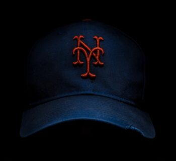
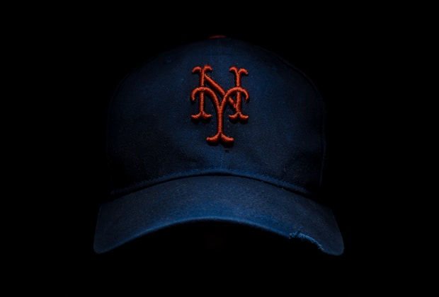
Let’s start with the hats. Most of the hat is dark grey, which has its significance (but we will talk about that), and topping off the button accented in purple to honor the color of the “7 Line Train” subway sign. The front of the hat has your traditional interlocking Mets “NY” logo in black with white outlining to make it the NY standout. Underneath the interlocking “NY” is the famous Queensboro bridge.
Now let’s breakdown the jerseys. Just like the hats, the majority of the jersey is dark grey. Now, why is this so significant? Well, it symbolizes concrete, as one of the many nicknames for New York City is “The Concrete Jungle,” which represents the urban living filled with tons of concrete buildings. That nickname became popular after Jay-Z and Alicia Keys hit song “Empire State of Mind.” Keeping with the current Mets road jerseys tradition, they have the NYC in the same font. What makes these jerseys so different is that they took that signature font and used it for the back names and numbers. This is something that will take time to get used to.
Now, here comes the fun part of the jersey. You will need to pay attention to the details and understand the significance. I’ll start with my favorite part, the sleeve patch. Surrounding the circular NY logo, the patch is decorated with a solid black background, paying a “fare” to the old NYC subway token. Sadly, the subway tokens have been out of circulation for 21 years, but this shows how vital the subway, specifically the 7 Line, is to Queens. It reminds me of when the Knicks did a similar logo back in the late 90s, which I loved (I’m a sucker, what can I say). Rounding out the design of the sleeves, below the patch, is the outline of the architectural design of the Queensboro Bridge with the purple trim on the cuffs connecting the significance of the 7 Line train again.
The final tribute to the 7 Line is how the pinstripes are formulated. Taking a closer look, you can see a circle and diamond pattern. If you have never taken the famous 7 Line train, you might not know the meaning of the circle and diamond. If you are rushing to see those Amazin’ Mets, you are hoping for the Express 7 train, noted with the diamond. If you are taking the scenic route, then hopping on the local circle 7 train won’t be a strike out for you.
After talking to my diehard Mets fans and getting their opinions on the jerseys, it seems to be either a “love them or hate them” situation. At first glance, these jerseys weren’t anything worth a whole article. However, once I discovered the hidden messages, I became a fan and needed to share the story. If you want to see these jerseys up close and personal, they will debut on April 27th and be worn for every Saturday home game (except June 1st) for the rest of the season.
IYKNYYK: If you know New York, you know.
🔗👉 https://t.co/dJI9OgUI32 pic.twitter.com/upb3kR6AS8
— New York Mets (@Mets) April 19, 2024
- Say hello to our new Nabers - April 26, 2024
- Danny & Nikki’s New York Giants Draft Predictions - April 24, 2024
- The New York Mets show off their new City Connect threads - April 21, 2024